AgoBeans
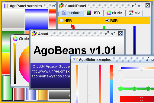
© Arcadiy Gobuzov 2004
Version 1.01
| Icon | Component | Description |
|

|
AgoPanel extends JPanel, so it can be used as the container for other components which you can setup, using any LayoutManager. The main difference between Ago & JPanel - there is Background which can contain Gradient or any image. Gradient - a class giving Image, formed of several points with key colors and the points forming transition from one key color to the other. Gradient can be horizontal or vertical. On present image you can see vertical Gradient with 3 key colors - orange, white and blue. You can make Gradient with any amount of colors, any distance between colors. There is an easy visual editor for gradient. |
|

|
AgoProgress - extends JComponent. Its functionalities are identical to a normal JProgressBar. You can edit Gradient for best view |
|

|
AgoSlider extends JComponent. Its functionalities are similar to a JSlider, but there are some important differences: you can use Gradient's Image for BackGround, You can to change a style (triangle, pentagon e.t.c) and a size of thumb. Component can have more than one thumb for editing a set of numbers from [0..1] |
|

|
AgoLabel extends JLabel. Its functionalities are identical to a normal JLabel, but has Gradient property and Timer which changes Foreground color, taking the value of the image from Gradient. You can edit a delay for this timer. Component helps to show advertising, alarm messages when you need to attract user's attention. |
|

|
AgoButton extends JButton. It's useful when it is necessary to show flashing message directly on the button. As well as in AgoLabel you can edit Gradient,delay and stop timer (runOn property) |
|
|
CombiPanel. This & next components extend abstract class ColorPanel & realize interface Colorable. ColorPanel - extends JPanel. These Components are useful for selecting Color. In most cases they are more flexible & better than standart JColorChooser. CombiPanel contains JTabbedPane which can contain any set of ColorPanels (described below). You can edit any property of any ColorPanel, containing in CombiPanel. ColorPanels can contain previewPanel (including your own). There are static methods for creating modal or non-modal dialogs for selecting Color. In the picture, you can see CombiPanel, containing 4 ColorPanels (CustomPanel is current), it also contains default previewPanel (hex value of current Color) |
|
|
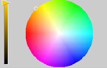
CirclePanel. Useful & nice looking component for selecting Color. Circle shows all colors. Changing position of Slider's thumb, you can manipulate with the brightness value. Circle & selected color will automatically change the brightness. You can edit slider's place (NORTH, SOUTH, WEST, EAST) & slider's view. You can also use oval, instead circle. Note: all ColorsPanels automatically change a size, when their container changes a size. Standart JColorChooser is good looking only with 400x300 dimension. |
|
|
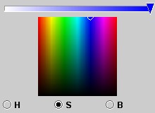
HSBPanel. Its functionalities are similars to a HSB page of JColorChooser. You can edit slider's & RadioButtons's places & slider's view. You also can use Rectangle, instead square. |
|
|
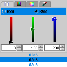
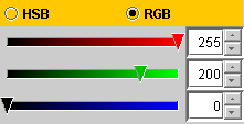
CustomPanel. Here you can edit (or see) exact RGB values of the current color. You can also use HSB mode instead RGB. Current color is being shown as a background for RadioButtons |
|
|
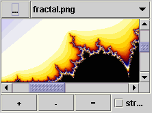
PixPanel. You can take Color value from pixels of any pictures (jpg, png, gif formats). You can increase or reduce a size of the picture, stretch picture along the whole accessible area. The history of the loaded files is kept in ComboBox. This component is blocked on an applet. |